Red Cherry Discusses Why Web Development Will Continue to Evolve in 2014
Throughout 2013, smartphone and tablet iterations altered how programmers and web development companies approached building web applications. In many ways this past year was a transition point. Brands, designers, and developers were finally acclimating their skills to the evolving mobile medium.

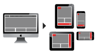
Calgary, AB -- (SBWire) -- 01/06/2014 --Responsive web design (RWD) was arguably the leading trend in web and mobile development over the past two years. And HTML5 continued to slowly but surely provide the means to "write once, and run anywhere." Now that the industry has become familiar with designing and coding for mobile users in addition to PC users, the line between 'mobile' and 'desktop' experiences is blurring.
Smarter Transitions
Mobile apps have contributed to a web design renaissance. The influence of iOS and Android designers on the way web developers go about building web applications is undeniable. Specifically when it comes to performing functions and interacting with a website's interface, developers will focus more on smooth web transitions that replicate a mobile app experience. Seamless performance with a visually pleasing interface is now a standard expectation thanks to tablets and smartphones.
With Retina screens and the introduction of 4K resolution, designers are focusing more than ever on seamless transitions that accompany website functionality. This applies to desktops and mobile devices alike. Spurred by advances in screen resolution, web development techniques and touch screen technology, users in 2014 will expect picture perfect visual aesthetics to accompany every function. With such increased screen clarity, users will spot the slightest of flaws. Throughout 2014 expect websites to seem much more app-like.
Blurring the Line Between OS and Browser
This past year saw the release of two significant milestones when it comes to browsers. Google and Mozilla released variants of their popular browsers as full-fledged operating systems. For the first time, consumers can choose to run their entire PC experience through Chrome and Firefox. With the rise in popularity of Chromebooks there is a new standard being set for who can offer a great operating system.
In 2014, expect the web browser to evolve into a new beast entirely. HTML5 web development for instance, can effectively port a console quality video game experience directly through a web browser. No plugins and no downloads required, just direct access to an immersive digital experience powered by a browser.
Renewed Focus on Go-Live
Following the international debacle that was the launch of Healthcare.gov, brands and organizations will place a major focus on flawless go-lives throughout 2014. Quality assurance processes and testing procedures became talking points on the 24 hour news cycle. For the first time ever, web development processes were engrained in the public. It was as if the United States had failed to reach the moon.
With such a disastrous precedent for a failed launch, companies will avoid any and all comparisons to the Healthcare.gov launch. By focusing on the non-glamorous processes like user acceptance testing and QA testing, brands will use the go-live phase to further exemplify their operational prowess. It may not be as exciting as a hackathon, but it will help ensure a more seamless launch and avoid damage to a brand's reputation.
A Focus on Typography
Websites and web applications will continue to adapt to mobile screen sizes. Tablets and smartphones have comparably different reading experiences and navigation than standard PC web experiences. One of the major issues with websites and web applications viewed via mobile, stems from the difficulty of reading text. To help solve this challenge in 2014, web developers will begin experimenting with the size, location, and layout of type-based content.
The trend of flat design, brought about by Windows 8 and iOS7, has resulted in a new take on text-content and its relation to web design. Brands like Audi have gone so far as to design their own custom font. Throughout 2014 expect to see websites where text based content is a focal point of the user experience.
Web Development In the Post-PC Era
Although we're progressing from PCs it does not mean that they're dead. Now that developers are acclimated to mobile web experiences, expect those lessons to emerge in the web development trends used this year. In my role as the CEO of web development company Icreon Tech, I work with clients on a daily basis who express interest in more immersive web experiences that stand out in today's app driven world. In 2014, the web will exhibit many signs that show we are in a post-PC era.
About Red Cherry Digital Solutions
Red Cherry Digital Solutions is the search arm of Red Cherry Interactive Solutions Inc. and is Calgary's #1 SEO & PPC Company. Red Cherry Digital Solutions specializes in ensuring that small & medium businesses gets prominently displayed in search results of leading search engines like Google, Yahoo!, Bing and more, to help small & medium enterprises connect with customers searching for what they offer on their website. Some of our clients are https://www.origination.ca/, http://www.actionmarine.ca/, http://actiontree.ca/.
For more information about their Web Design Software, SEO & PPC services, please visit: http://www.redcherryinc.ca/
Media Relations Contact
Dan Carter
CEO
RED CHERRY WEB SOLUTIONS
888-401-6668
http://www.redcherryinc.ca
View this press release online at: http://rwire.com/426334