Red Cherry, a Calgary Based Web Design and Software Company Discusses Things to Keep in Mind when Hiring a Web Designer or Design Company
Web design is a critical component in effective marketing and lead generation. Today’s competitive websites are designed for a mobile world, one that emphasizes video content engagement and crisp content blocks designed to captivate visitors—and convert visitors to customers.

Calgary, AB -- (SBWire) -- 11/24/2014 --What are the top trends powering web design for 2015?
Minimalist Design: Clean, minimalist designs eliminate the risk of cluttering up a website and present an ideal design approach for clearly and purposefully presenting design and content elements in a concise, clear fashion. Simple splashes of color can add creative elements to a clean minimalist design—one that expresses a business or brand in a conceptually stark, yet appealing, manner. Minimalist designs make great use of simplicity and outstanding, creative play with typography and even whitespace.
Video Engagement: Today’s websites require powerful visual content, particularly videos. Videos are engaging. Videos are authentic. Videos are great for mobile users. There is a mobile video revolution happening right now. YouTube is No. 2 in search engines. Some 40 percent of YouTube's traffic now comes from mobile devices. our customers are viewing our website from their mobile devices—and they want to be entertained. Videos provide an opportunity to quickly engage our website visitors, allowing them a fast platform to be informed and delighted. Think delighting our website visitors isn’t as important as informing them? We’re wrong. Today’s web surfers want to be mesmerized and entranced. Videos are an effective visual content tool for intriguing our website visitors to learn about our business—and navigate other pages of our website for increased awareness.
Crisp Card Design: Are cards the future of website design? They are certainly web design’s present. Card design is visible more and more on websites for B2B and B2C targets. Think Pinterest. Card design layouts are highly functional and effective mechanisms for conveying rapid-fire content in concise bursts—allowing for website visitors to get an immediate glance at our products, services, news, philosophy of business and more. Google uses card design! With Google Now, information is shared on simple cards that appear just when the user needs them—immediate information in a clean content carrier. Cards allow our website to deliver information in small, almost snack-sized formats. When visitors are checking out our site on their smartphones, they want to see neatly organized content blocks. Card design gives them what they want, resulting in happy visitors to our site.
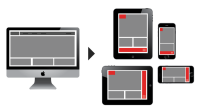
Go Responsive, Now! Sleek, brilliantly mobile and intuitive, responsive websites are the ultimate in user engagement for web design today. Responsive websites started gaining traction during 2012, when more businesses realized that mobile engagement was a mandate. As mobile device usage surged, the need for mobile-friendly websites fast became essential, driving web designers to create sites that looked brilliant on any device. The beauty of responsive websites is they employ coding that actually changes the layout and content displayed, depending on the device viewing the website. Text is always clear, easy to read and images are always enjoyable, even on a smartphone. Responsive web design has been an increasing trend since 2012 and, for 2015, it is nothing less than a mandate for competent and competitive web design.
Scroll On: A hot trend in web design is the scroll factor—parallax scrolling. Parallax scrolling is a visually pleasing 3D effect created when the background of a website moves at a slightly slower rate to its foreground. Parallax scrolling gives visitors a pleasant content experience, as an element of depth appears to cushion the content. Smooth animations and unique visual effects are commonplace in the world of parallax scrolling, resulting in a customer-centric design that provides a pleasing navigation and easy content experience.
Web design tools, techniques and tricks are continually evolving to deliver a creative, crisp viewing experience for today’s mobile viewers. Websites that capture the very best of what today’s modern designs have to offer will score high marks with their visitors in 2015.
Web design trends come and go, but one thing will remain constant and that’s a well maintained and functional website. We’ve only highlighted 5 of the more common mistakes we come across, sure there are many more we can add to this list but these are a good place to start. If we think of any other common mistakes we’ve missed please add them to the comments section below.
About Red Cherry
We are a digital marketing and software agency that stands out from all other agencies. Our team of talented and creative individuals work closely with us to deliver rich and engaging solutions that drive qualified traffic to our website and convert that traffic into sales. Red Cherry has offices in both Kelowna, BC and Calgary, AB. We work closely with them to develop a comprehensive digital marketing campaign for Facebook, Google, Twitter, Remarketing (largest ad network), Pay Per Click, SEO, and more. Providing website design in Calgary for over 10 years.
We are also a full scale software development firm specializing in web development and apps development.
Let's chat 888-401-6668 or visit http://www.redcherryinc.ca/
Media Relations Contact
Dan Carter
CEO
Red Cherry Web Design Calgary
888-401-6668
http://www.redcherryinc.ca/
View this press release online at: http://rwire.com/564365